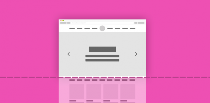
The area above the fold of a website is the most important area design-wise. By above the fold, I mean that area that users see before they start scrolling through the page. There are a lot of elements you can add above the fold in order to make a page or a landing page more effective. There are a few important tips to keep in mind to maximize exposure and make the above-the-fold area that much more effective.
Large Headline and Compelling Excerpt
A lot of websites, quite naturally so, add a strong call to action directly at the top part of the page to increase conversion. There is nothing wrong with this approach, especially if you’re trying to convert visitors into customers as quickly as possible. That said, there are a lot of added benefits to enjoy when you can use the above-the-fold area to persuade users to scroll.
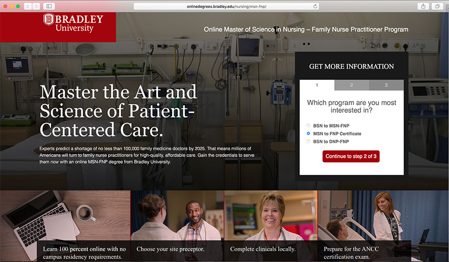
Take a look at the Bradley University FNP program page and you’ll see exactly what I mean. The page uses a big headline and a compelling excerpt to persuade visitors to learn more. There is still a strong call to action at the end of the page and conversion rate can be kept at maximum thanks to the effective CTA placed above the fold.

The family nurse practitioner page of the university also adds an actionable form above the fold, which brings us to our next point.
Add Interaction
Users love to have the ability to interact with the website they’re visiting. This is part of the reasons why parallax sliders and similar elements are very effective when used above the fold. The same can be said for interactive forms and other elements that users can interact with.
Using the previous example, the FNP page of Bradley University adds a nice form to allow users to get more information. The form is further divided into three steps, creating an easy-to-follow wizard. Combined with the full-width image background, the form stands out from the rest of the page.
If you do want to add an interactive element to this portion of the page, make sure it works perfectly regardless of the users’ device or web browser of choice. The last thing you want is a bad user experience because of a faulty animation or a form that doesn’t do anything.
Keep It Simple
It is easy to start adding too many elements above the fold in an attempt to make the page as attractive as possible, but less is often more; in this case, less IS more. Keep the area above the fold simple and easy to understand. More importantly, make sure this part of the page gets loaded in under 3 to 4 seconds for maximum user retention.
A lot of things depend on how the above-the-fold area is designed as well as how it performs. The user’s first impression, overall user experience and the effectiveness of your page as a whole depends on how well the above-the-fold area works. Be sure to use these tips we talked about in this article to help you create the perfect page for your site.
