In the world of putting things before others (case in point: mobile-first, content-first, scroll-first, and more), can we all take a moment and remind ourselves that the entirety of web design is supposed to put user-first?
That sounds good in theory. A lot of us are aware of it (in the back of our minds). Bringing it to fore, however, and turning it feasible is slightly more difficult than that. But it’s necessary. Especially, and more so, in an age where half of world’s population will be using smartphones for just about everything within 2 years.
So if the threat of lower search rankings (Thanks, Google) on almost half of your potential audiences’ devices has driven you to going responsive, you’d do well to heed the following points.
This article is to give developers and designers some things to keep in mind to make their products a little more user-friendly.
Let’s start with…
1. Text Size
On desktop, it’s usually not a major issue if your text is the size of 9pts, 72pts, everything else in between or beyond. It’s fine as long as it’s context appropriate (caption font size is usually smaller than paragraphs; headlines/titles are the largest, etc.).
On mobile… not so much.

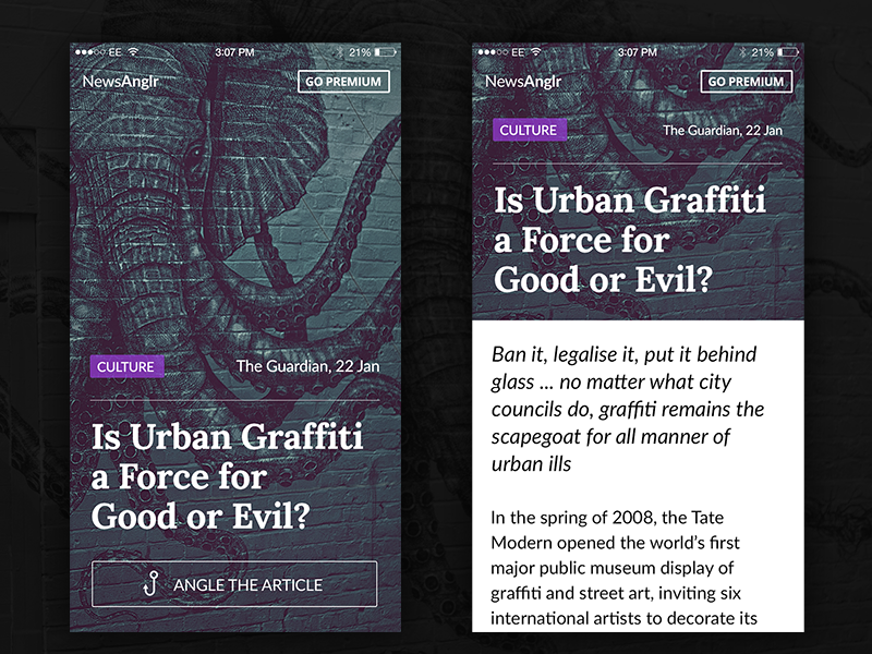
Article Mobile Layout by Kyril Ku
While you may want to give more priority to familiarity with skeuomorphism, you may end up killing legibility for mobile user with dramatically different font sizes.
You want to make sure the actual content (the article/post) starts within the users’ initial, immediate view of the page (fold or not). You don’t want the headline hogging all the space. You also really don’t want too many font-sizes confusing your users.
In essence: Keep the changes in font-sizes to a bare minimum. Two is best, three at most, but try not to go further than that.
2. Tap-Target and Button Size
Inline text links can be clicked easily with a cursor. But imagine the difficulties of users trying to ‘tap’ at, say, 4-5 tightly packed links in a single line of text. Most of the time, they’ll end up clicking at the wrong link.
If that’s something you’ve forgotten to give a thought to so far, make a point now.
Google PageSpeed Insights gives you a number to make it easier:

The most frequently used buttons on your site are likely going to be navigation, so make sure you size them properly (within a margin of +/- 5 pixels). The most important ones are going to be your CTA (Call to Action) buttons, menu, etc, so remember to size them well.
Also remember to leave enough ‘padding’ / whitespace around those buttons so your users don’t end up clicking somewhere else by mistake. Many sites deliberately put advertisements next to navigation buttons for higher CTR (Click Through Rate), but know that it’s a bad practice and will annoy your users.
3. Experiment with some fresh ideas

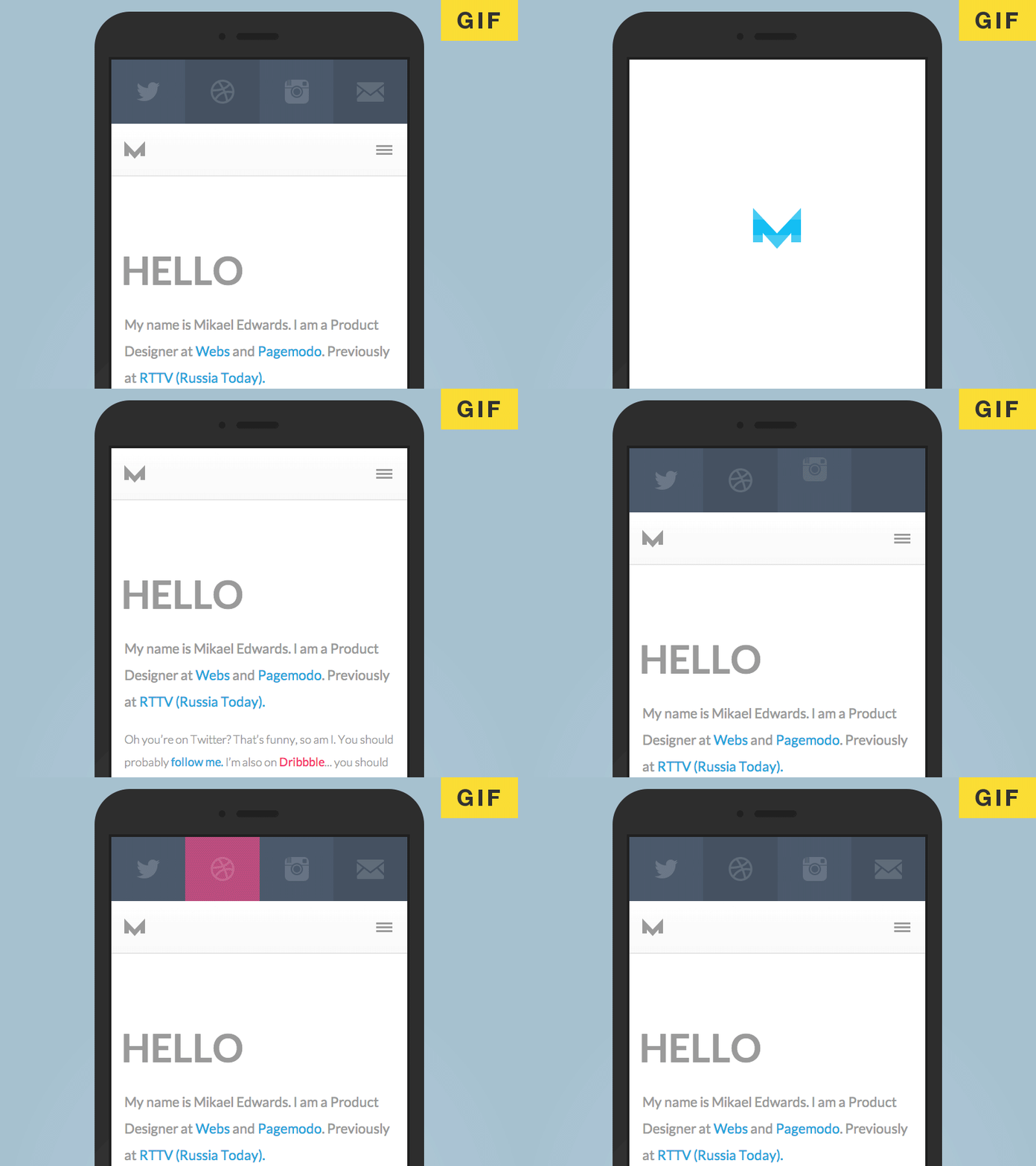
- Starting with Dividers. This is best explained with an example. Check out the website of Matt Mullenweg, one of WordPress’ founders.This is a great example of using background design to get rid of a component (page breaks/ margins/ separations etc.) without killing legibility.Dividers serve no purpose beyond that of separating individual pieces of content. Yes they’re important. I also think we can do away with them completely in the age of infinite scrolling.
- Then, Get friendly with animation. The days of Flash are past (even Adobe knows it) and more designers than ever are hopping on board with CSS (and some Js sprinkled) transitions and animations to spice up and enhance almost any design without damaging performance and page speed.These animations draw the eye of users far too used to flat-style designs and buttons.Here are some examples: The responsive cat by Masayuki Kido (it’s the cutest thing ever!), The Man from Hollywood (Kinetics type ‘experiment’ by Tyler Gaw), and the sheer awesomeness of this Periodic table of elements (created with three.js library by Mr. Doob).
- And the ‘sideway scrolling’: The general consensus on this one is yet to form, but everyone can agree that used in the right context (image showcase, galleries, storytelling, )Here’s a nice little behind-the-scenes comic from the Walking Dead. Enjoy it first, and pay attention to the parallax later.
Really. You don’t have to leave your creativity behind in lieu of simplicity at all. Follow trends but in relevant contexts.
4. Forms and Fields
You know there’s something missing in a conversation about the UX if Forms never come up.
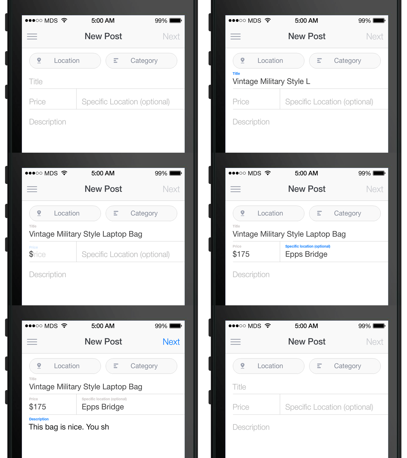
By now we know that the best practice is KISS (Keep it Short and Simple). Take Twitter, Mozilla, Facebook, etc. They all have 2-field signup forms.
Nobody wants to fill out a form. It’s a tedious, boring task that your users suffer through out of sheer love (or requirement) for your content/product/service. You can at least do them the courtesy to keep the pain minimum. Make the forms short enough to fit on a mobile screen without having to scroll. Also: Keep the fields large (almost the size of buttons and very tappable).

Now that you have reduced the agony to a bare minimum, you can try to spruce up the form a bit, just to keep things at least a little interesting. Don’t be so blunt as to ask for “Name, Age, Phone no., E-mail” and ask them to “Click here”. That evokes about the same level of trust as a shady alley in a dank, seedy area of the city.
Try being a bit more conversational. Instead of asking what you need, ask what users need to provide. Make the form user-centric: It improves comprehension and makes it easy to fill.
On a related note, here are some great form ideas from waaaay back in 2008 compiled by Vitaly Friedman.
5. Sticky Navigation: Anytime, anywhere
Another topic that must always come up in a UX conversation is navigation.
Simplicity in site and content architecture paves the way for an easier, simpler navigation, so start with those. Cut down the content categories brutally until you have 4-5 major ones. These will be your tabs.
![]()
by Ramotion
With this beginning you have made your site simpler to understand. You have also almost completely removed the need for a ‘Hamburger’ (I don’t like the idea of stuffing my belongings in the ‘attic’ where ‘no-one can see them’ without ‘performing an action first’). Users will barely stay on your site for seconds. You want to impress, not hide. Show off your content in style instead of ‘hiding’ it all with a Hamburger. Even, and especially for the mobile, tabs work better than hamburgers.
You have your tabs. Now make them Sticky, especially with infinite scrolling or overly long pages. This removes the need for a middleman in the form of ‘Back to Top’ button. For sites with lots of content and pages (e-commerce, blogs, etc.), an added search engine is a bonus for your mobile users.
Endnote
These are but some very basic and easy to remember tips to make your design more user-first (which is honestly the only first that matters).
Remember to optimize for mobile and test rigorously and you’re good to go.
Author Bio: Tracey Jones is a renowned web development professional with hobbies of creative and technical writing. Currently, she is associated with HireWpGeeks Ltd., a leading WordPress customization company across the globe. Being a passionate writer, she has been actively writing about the web development and web design technologies.
