The web is full of flat color fields. It is the easiest solution for a design in HTML(compatible with any web hosting plan), but it is not easy on the eyes. In a design such as for brochure printing, visual appeal is easy to create with gloss, textured paper, or unique folding techinques. But how do you make your website stand out while being comfortable to read? Subtle texture in several areas is a great start.
Texture is one of those design elements that can be used gently or aggressively. The key to adding some texture is to know how and why you want to spice up an area of your site. Don’t just start texturizing everything you can. Be intentional.
You have a couple of different options for texture. You can use repeating patterns, textured graphics like wood grains or concrete, or photographs.
Header:
Across the top of the page, the header tells the user where they are and often how to navigate the site. Proust uses texture nicely to set their header apart and make it the first thing you see. The lighting of the texture draws the eye toward the brand, working with the design – not distracting you away from the most important elements.

Background:
The content of your website is important. The background should avoid drawing attention from your text and photos. LearnVest sets itself against a quiet grey pattern that frames the page well. Background textures run the gamut form extremely textured to subtle, like LearnVest’s design. A little goes a long way. Start with subtle and build from there.

Logo:
Many logos are designed to present well in two colors, which is a practical consideration for real-world use. But many designers are recognizing that the vast majority of the time, a logo will be displayed in either full-color print or on the web. Squared Eye uses textures on their whale logo to gently add depth.

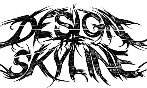
And in the spirit of two-color designs, this Design Skyline logo has plenty of texture with just two colors:
Photograph:
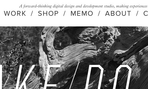
A texture does not have to be repetitive. Many beautiful patterns are found in nature and the world around. Weightshift uses a photograph under the header to give weight to the site. This technique has seen a rise in popularity and is very easy to implement in web design.
Border:
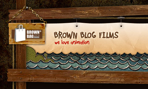
The web is built on squares and grids. Blocks of text, images, navigation menus, headers, all are framed inside four walls. Brown Blog Films uses a quality wood texture to build their website’s frames. Frames can work in tandem with other textured elements or be used as a stand alone technique.
Wholistic:
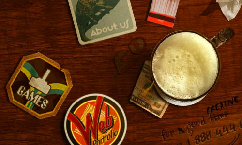
A website can feel like a photograph, like a scene from any part of life. Lounge Lizard uses texture to give the impression that their site is a literal desk. This also breaks the design out of grids and blocks of content. Beware, though – this may not function on mobile devices.
Typography:
Typography is another easy way to add texture to your web design. With the @font-face CSS attribute, you can use fully selectable fonts that are fun and visually interesting. Using jQuery plugins like Lettering.js, sites like Lost World Fairs can create beautiful typography that is still fully selectable and readable by both humans and search engines.

What are some of your favorite ways to add texture?
Tara Hornor
Tara Hornor has a degree in English and has found her niche writing about marketing, advertising, branding, graphic design, and desktop publishing. In addition to her writing career, Tara also enjoys spending time with her husband and two children.
